Design that carries a brand
Logos, brand systems, print collateral and digital ad design — for an auto workshop in Hamilton, a formwork specialist in Singapore, a Toronto agency rebrand, and a run of Sri Lankan businesses.
Four things, made to work together
Logo & identity
A primary mark, its variations and the rules for using them — designed to still read at a favicon and on a shopfront.
Brand systems
Colour, type, layout and imagery direction written down, so everything produced afterwards looks like it belongs together.
Print collateral
Loyalty cards, business cards, flyers and signage — set up correctly for the printer, not just the screen.
Digital & social design
Ad creative and social templates a team can reuse — same look, campaign after campaign.
From a sketch to a system
Every mark starts rough — on grid paper, then in vector. We push a shape until it holds up small, in one colour, and reversed out of a dark background — and, where it helps, until the word itself carries a second meaning. Only then does it become a brand: fixed colours, type, spacing and templates, handed over as files the client's own team can build on without coming back to us for every flyer.
Roughing out a wordmark on grid paper — where the letters can do two jobs at once.
A full brand for a Hamilton workshop
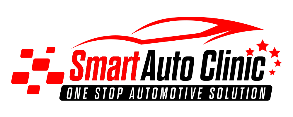
- Logo & wordmark
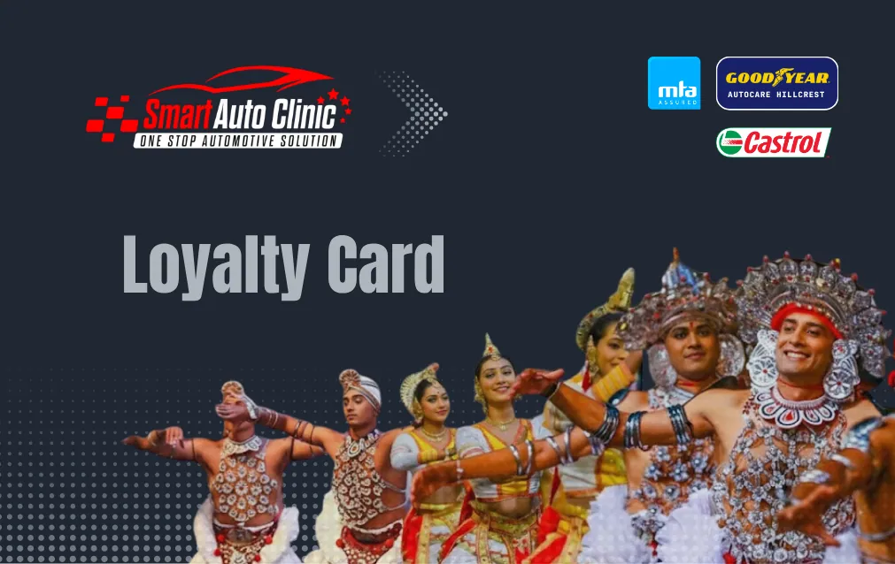
- Loyalty card (print)
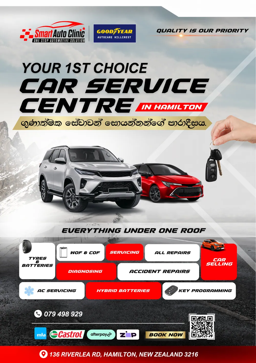
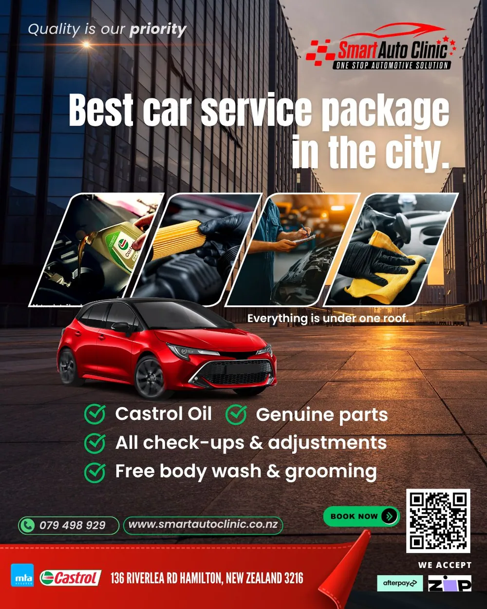
- Ongoing ad design
A one-stop automotive centre in Hamilton, New Zealand. We built the identity — the racing-flag mark and wordmark — then the collateral around it: a membership loyalty card and a running set of social and print ads that hold the same bold red-and-black look campaign after campaign.







Design & branding, in short
Four things, made to work together: logo and identity design (a primary mark, its variations and usage rules — designed to still read at a favicon and on a shopfront), brand systems (colour, type, layout and imagery direction written down so everything produced afterwards looks like it belongs together), print collateral (loyalty cards, business cards, flyers and signage, set up correctly for the printer, not just the screen), and digital and social design (ad creative and social templates a team can reuse, same look campaign after campaign).
Every mark starts rough — on grid paper, then in vector. We push a shape until it holds up small, in one colour, and reversed out of a dark background — and, where it helps, until the word itself carries a second meaning. Only then does it become a brand: fixed colours, type, spacing and templates, handed over as files the client's own team can build on without coming back to us for every flyer.
Featured clients include Smart Auto Clinic (a one-stop automotive centre in Hamilton, New Zealand — logo and wordmark, a print loyalty card and ongoing ad design), NuForm System (a formwork specialist in Singapore and Malaysia), 6ixSenses (a digital agency rebrand in Toronto, Canada), and several Sri Lankan businesses including CeyHerbal, CeyPearl, Gems Sri Lanka and Water for Life, plus PromoTub. The work spans four countries: New Zealand, Singapore, Canada and Sri Lanka.
Design packages start from NZD 800. The scope depends on what you need — a standalone logo, a full brand system, print collateral, or ongoing ad templates. Book a free 30-minute consultation with whatever you have — a name, an old logo, a rough idea — and we will tell you what a brand build would take.
Let's design the mark and the system around it.
Book a free 30-minute call. Bring what you have — a name, an old logo, a rough idea — and we'll tell you what a brand build would take.